Sellers’ Operation System of Ymatou
Web/Mobile homepage redesign
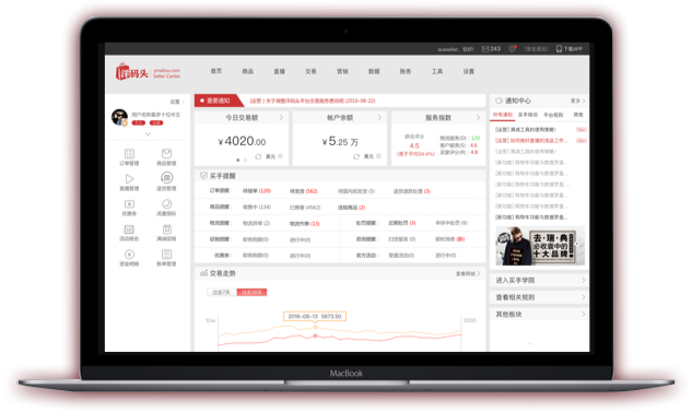
Overview
Time: 2016.08-2016.10
The issues that every seller will absolutely concern about are those related to his or her business, such as volume and quantity of sales and the things need to do, e.g. order receiving and goods delivering.
The unreasonable page layout, the disordered information hierarchy and an imperceptible entrance all made the old version barely used Through redesign, users (sellers) can find their concerned information and go to next step quickly.
Team Role
Role: User Research /Interaction Design
Method: brainstorming, interviewing, quick prototyping
What I Did:Setting goals and objectivesStakeholder interviewsAnalyzing users’ painCreating scenariosCreating concept pathCreating information architectureLow/High fidelity prototypesRedesigning Homepage

Old Version of Homepage
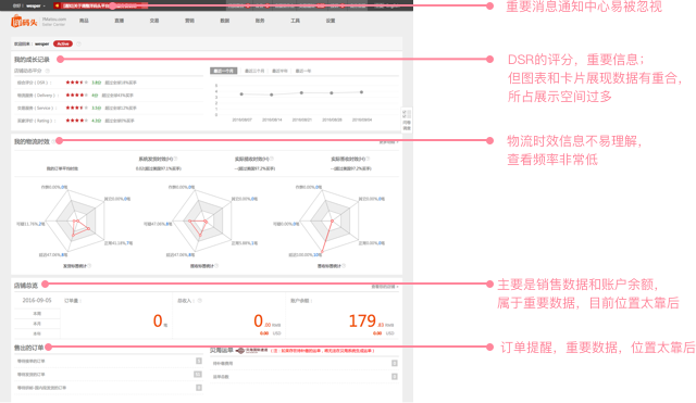
Sellers’ homepage of Ymatou was mainly consisted of three modules with unclear and unreasonable information when I began working on it in August 2016. To the contrary, the header was fulfilled with various informations that would be ignored easily. Also, the UI of this page was in need of an update.
Goals of Redesign
In nature, homepage is some kind of navigation page. The key feature of it is to guiding users to the next step. Seller’s homepage plays the same role that help users get useful and specific information quickly and effectively, guide them to the landing page easily, and remind them to do list.
Then there are three goals of redesign:
Page layout
Redesign the layout according to the importance degree of information with the users’ attention to match.
Business focus
As an aggregated page of online business, homepage do assimilate with workbench which offers people an ideal place to do their specific work.
Efficiency raising
Users can deal with their business efficiently, be informed of useful information in time and get a clear view of business performance.
Redesigns tend to aim at answering three main questions:

e.g.
How much have I earned?
How many people place orders?
Has the sales grown?

e.g.
Are there any questions from customers? Have I replied?
How many orders that I have not received?
How many orders should be shipped today?
Are there any order pending changing or refunding?
Are there any rule-breaking operations? Have I handled?
Are there any goods out of stock?

e.g.
How to encourage regular customer to place the order again?
How to attract new customers?
Should I add new products to my online store?
How to increase my profit?
Users' Concept Path
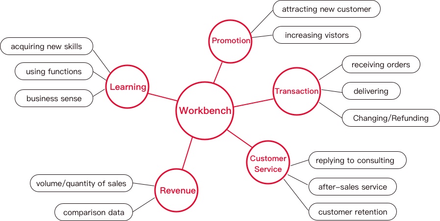
The main purpose of concept path is to reveal users’ operation path according to previous studies and monitoring data.
Information Hierarchy
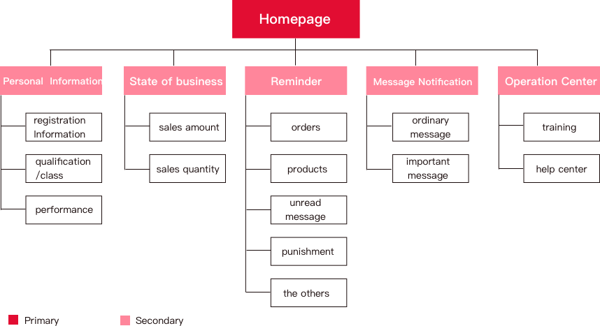
According to concept path, we get information hierarchy which defines the hierarchy of information and the importance of five main functional modules. This figure will provide us an outline for design.
User Research Findings
By analyzing and synthesizing the data gathered from interviewing of six people, we were able to find some ignored points of the matter. This led to three insights that will help us formulate what specific areas and problems our solution needs to target.
Insight 1:

Users of our product are not as professional as we expected.
They need some useful suggestions in many situations.
Insight 2:
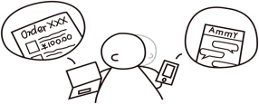
One user may use different device to deal with specific task.
Insight 3:
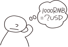
Users who live aboard would like use local currency to calculate profit and loss quickly.
Layout Design
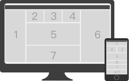
We set all the information in a frame of a Flat Structure with card form and make sure the most important parts are presented in the first screen. As shown in the figure, seven main modules are organized depending on different device. The web layout is left-right structure with an influx of information on one page while the app’s is up-down structure with several pages.
High-fidelity Prototype
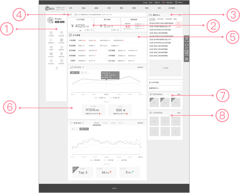
On the base of all above, we create several schemes with quick prototyping. Then after validating various concepts with participants and clients, their feedback led us to integrate those schemes and finally create and develop high-fidelity prototypes.
Features


Left Navigation
It includes personal information and quick entrance.
The primary menu of horizontal navigation usually uses two Chinese characters that sometimes are too abstract to understand classification rule. Users have to locate their frequently-used pages according to their memory which means they have to consume a lot of cognitive resources to remember. With the help of custom navigation on the left, they can recognize their frequently-used pages rather than remember them.
We use icon style for left navigation to fit response design in the future.

Data Card
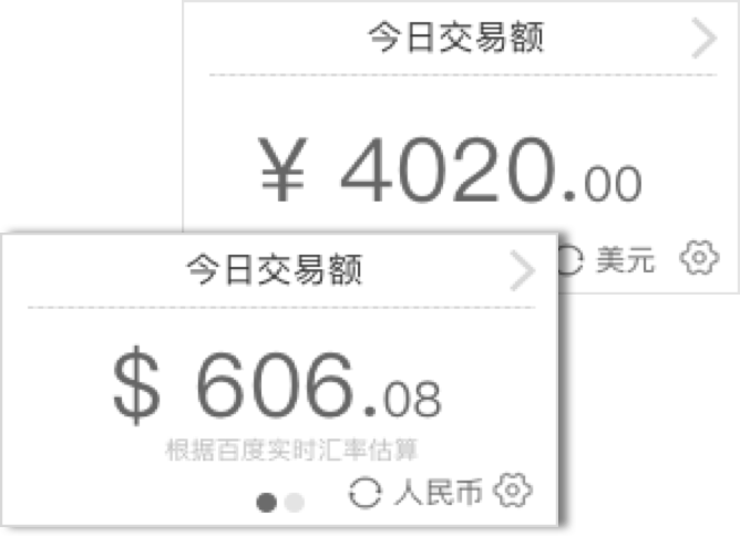
We use data card to present the core data, sales, balance and performance of online business which users concerned about.
Sales: a live data of today’s income and user can enter detail page by clicking this card.
Currency exchange: users can calculate profit and loss conveniently by this custom function.


Message notification
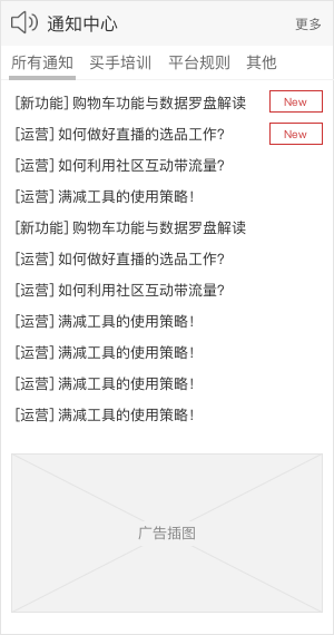
All messages will be shown in this module, and new messages will be labeled.
Relative important messages will scroll on the Marquee.
The most important notification will be shown as an alert.

Reminder
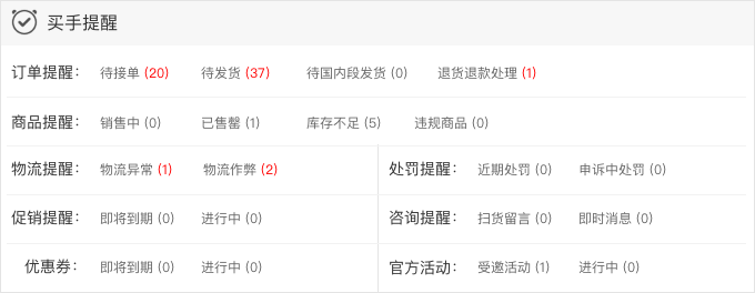
This module, situated on the center of homepage, is used to remind users according to business type. Users can enter into corresponding pages when they click numbers.
Whether the number is red or not is according to the importance and emergency degree of reminders.

Tendency Chart
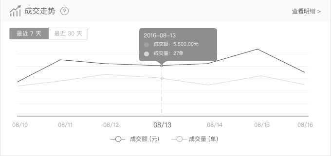
It showed the tendency of core indicators of business in a period of time.
Several charts can be arranged by order if necessary.
Users can determine the number of charts shown in homepage in the future.

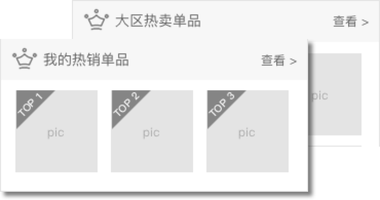
Top Selling
Users can have a quick look of their hot sales.
It provides users suggestion of selecting products to some degree.
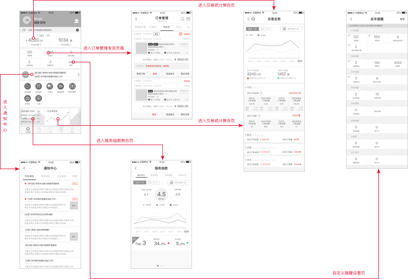
App Homepage Redesign
Since the size of device is much smaller than computer, it is impossible to present all the information in one page. Then we design several pages according to information hierarchy.
Redesigned homepage become the highest used page when users use sellers’ operation system.